黛珂蘭の藝術設計

MyTSA | APP Redesign
Project Type Interactive Mobile App Redesign Prototype
Role UI/UX Designer, Software Prototyper (Figma)
Problem
The original MyTSA app—developed by the U.S. Transportation Security Administration—offers key flight and security information, but suffers from outdated UI, rigid structure, and low engagement, especially for frequent international travelers and non-U.S. users. It lacks the flexibility, speed, and emotional feedback modern travel apps demand.
Key Improvements
Restructured information hierarchy for faster access to core features
Visual-first approach to luggage and item restrictions
Integrated gentle animations and micro-interactions for feedback
Balanced professional tone with approachable aesthetics
Approach
Inspired by Asia’s super app design logic, I redesigned MyTSA to support a more intuitive and modular task flow: 1. Select Airport. 2. Choose Flight / Travel Scenario. 3. Check Item Restrictions via Visualized Luggage Guide. 4. See Crowd & Wait Times with Real-Time Insights
The redesign also introduces personalized travel profiles and customizable packing lists, improving not only utility but also user retention and onboarding experience.
Outcome
A more adaptive and user-aware TSA experience—designed for both first-time travelers and seasoned flyers, across cultures and contexts.

Original MyTSA APP UI/UX Flow Analysis

Developing Redesign MyTSA APP UI/UX Flow

Intial Wireframe Design Round#1

Intial Wireframe Design Round#2

Login Screen - Final Prototype

Dashboard - Final Protype (Left side is the original MyTSA APP)

Ask TSA - Final Prototype (Left side is the original MyTSA APP)
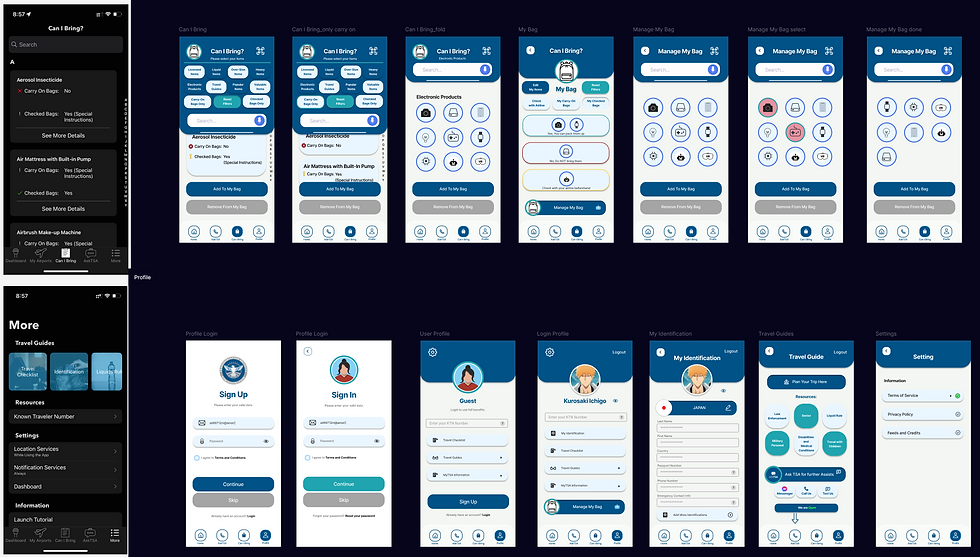
Can I Bring & More/Profile - Final Prototype (Left side is the original MyTSA APP)