黛珂蘭の藝術設計
VOID
CARD
GAME
Truth is a conversation
—VOID is how you begin

scroll
What Is VOID?
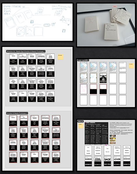
VOID is an experimental card game that blends psychology, storytelling, and interaction design to help players explore their inner world and interpersonal dynamics. It transforms abstract emotional concepts into tangible, playful experiences—designed not just for fun, but for reflection and connection.

Why the Name “VOID”?
In relationships, these “voids” show up as silences, misunderstandings, or disconnects.
Rather than ignoring them, VOID invites you to step into that space—to explore what’s hidden, unsaid, or unfinished.
It is not a place of nothingness, but a place of potential.
A mirror. A question. A beginning.
The name VOID embodies the game’s purpose:
To transform emotional avoidance into connection, and silence into meaningful dialogue.
-
“A Void” represents emptiness, the emotional blank spaces we often avoid confronting.
-
“Avoid” reflects our tendency to turn away from uncomfortable truths—our unmet needs, unsaid words, and unseen selves.
Create Your First Project
Start adding your projects to your portfolio. Click on "Manage Projects" to get started
ZERO TO ONE – Book Jacket Design
Role
Graphic Designer, Photographer
Deliverable
Redesigned Book Cover (Print & Digital)
Brief Overview
This project reimagines the book jacket for Zero to One by Peter Thiel and Blake Masters—an influential text on innovation, entrepreneurship, and building groundbreaking companies. While previous editions varied across regions, most designs shared a flat typographic approach with minimal visual storytelling, relying on color to differentiate versions. This redesign sought to provide a more concept-driven, emotionally resonant visual identity that could speak to both new readers and experienced entrepreneurs.
Concept & Design Strategy
The central image of a cracked egg with a rising “1” represents the birth of original ideas—a metaphor for the book’s core thesis: that meaningful progress arises not from iteration but from creating something fundamentally new. The muted palette and clean layout offer a sense of professionalism, while the surreal photograph introduces surprise and narrative depth.
The vertical title alignment reinforces the idea of forward motion, while custom textures and subtle lighting choices make the physicality of the design more impactful—standing in contrast to the flatness of prior versions.
By placing emphasis on visual momentum and minimalist tension, the redesign invites curiosity while capturing the contrarian spirit of Thiel’s thesis.
Before & After
The original covers were clean but generic, dominated by static type and color coding (yellow, blue, white). They conveyed structure but lacked a visual hook. In comparison, the redesign positions the book as both serious and imaginative, appealing to a generation that values design-driven communication.
Visual Development
The “1” rising from the egg was first sculpted and staged using mixed-media modeling, then photographed under controlled lighting. Typography was iteratively developed to maintain readability while supporting the visual metaphor. The final composition was balanced to ensure shelf presence without overwhelming the message.
Reimagined Peter Thiel’s Zero to One with a metaphor-driven visual identity, replacing static typography with a surreal image symbolizing innovation from “zero” to “one.”