黛珂蘭の藝術設計
VOID
CARD
GAME
Truth is a conversation
—VOID is how you begin

scroll
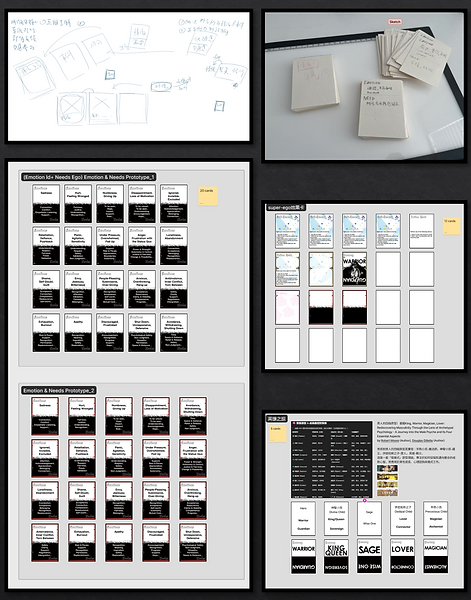
What Is VOID?
VOID is an experimental card game that blends psychology, storytelling, and interaction design to help players explore their inner world and interpersonal dynamics. It transforms abstract emotional concepts into tangible, playful experiences—designed not just for fun, but for reflection and connection.

Why the Name “VOID”?
In relationships, these “voids” show up as silences, misunderstandings, or disconnects.
Rather than ignoring them, VOID invites you to step into that space—to explore what’s hidden, unsaid, or unfinished.
It is not a place of nothingness, but a place of potential.
A mirror. A question. A beginning.
The name VOID embodies the game’s purpose:
To transform emotional avoidance into connection, and silence into meaningful dialogue.
-
“A Void” represents emptiness, the emotional blank spaces we often avoid confronting.
-
“Avoid” reflects our tendency to turn away from uncomfortable truths—our unmet needs, unsaid words, and unseen selves.
Create Your First Project
Start adding your projects to your portfolio. Click on "Manage Projects" to get started
LEGO Annual Report Web Design
Role
UI/UX Designer, Webflow Developer
Deliverable/s
Interactive Annual Report Website
Brief Overview
Brief Overview: This project is a digital reinterpretation of LEGO Group's Annual Report, designed to improve how both internal stakeholders and external audiences engage with key information. As a globally renowned toy company with a strong commitment to innovation and creativity, LEGO uses its annual report not only for financial transparency, but also to communicate brand values, sustainability goals, product innovation, and global impact.
The redesigned website transforms LEGO’s traditionally dense PDF report into an intuitive, interactive platform. It enables executives and management to quickly access performance insights, while offering fans and the general public an engaging way to explore LEGO’s recent achievements, sustainability initiatives, and future strategies — all through a visually-driven, user-friendly interface.
Challenges and Solutions
One key challenge was balancing a professional corporate presentation with LEGO’s inherently playful and colorful brand identity. To achieve this, I developed a modular visual system that combined clean grid layouts and corporate typography with LEGO-inspired color schemes, icons, and subtle motion. This ensured that while the interface looked polished enough for executive review, it still evoked the brand’s imaginative spirit and remained visually inviting for broader audiences.
Another challenge was making dense report data more digestible for two distinct audiences:
LEGO’s internal management team, who needed quick access to performance metrics and strategic updates
Fans and external stakeholders, who wanted to explore LEGO’s impact, sustainability efforts, and innovation highlights in an engaging way
To solve this, I implemented interactive infographics, collapsible sections, and scroll-triggered animations that prioritized clarity without overwhelming users. The information architecture was guided by UX research and informal interviews, which indicated that different personas preferred different levels of depth. Executives could scan KPIs quickly, while fans were more likely to explore narrative-based content with visual storytelling.
A digital reinterpretation of LEGO’s annual report, designed to help executives quickly review key performance data while offering fans an engaging way to explore LEGO’s achievements and future goals. The design balances corporate clarity with LEGO’s playful identity, combining clean layouts with brand-inspired visuals and motion.
Through interactive data visualizations, scroll-based storytelling, and modular layouts, the project simplifies complex information for diverse users. It’s a responsive and brand-consistent experience that brings strategy, creativity, and accessibility together.